

Colors
Colors that leave the words clear.
Check text and background colors against WCAG contrast thresholds, including transparency. Find a passing text color and preview approximate color vision differences locally.
By KeepSimp 4 min read
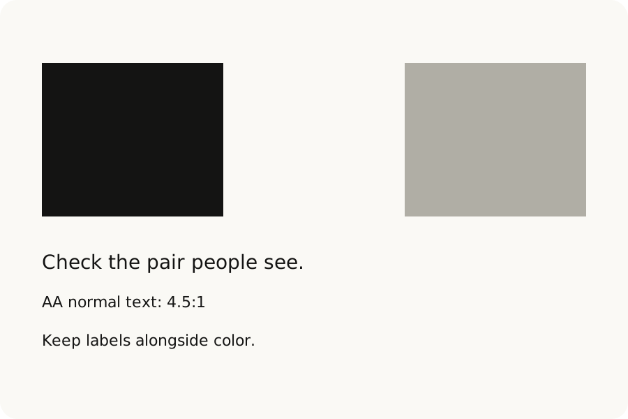
A palette may look lovely while its words are hard to read. Contrast checks one part of that problem: how much lighter one color is than the other. KeepSimp lets you test the actual pair, with transparency included.
Choose the pair people will see.
In Contrast, enter the text color and background color. If either is transparent, choose the opaque canvas behind them. KeepSimp maps the colors into sRGB, composites the background over the canvas and the text over that background, then measures the contrast ratio.
The preview deliberately shows the colors you entered, even when they fail. The pass and fail labels beside it use the unrounded ratio, so a displayed 4.50 cannot turn a value just below 4.5 into a pass.
Use the threshold for the job.
WCAG AA requires 4.5:1 for normal text and 3:1 for large text. AAA requires 7:1 for normal text and 4.5:1 for large text. Large means at least 18 points regular or 14 points bold. Required non-text contrast for relevant controls and graphical objects is 3:1.
Choose a target and ask for a passing text color. The tool looks along the original color’s OKLCH lightness range, maps candidates to sRGB and checks the actual exported code. The suggestion is opaque; apply it explicitly before replacing your current text color.
Text: #000000
Background: #ffffff
Contrast ratio: 21:1
A score is only one part of reading.
The protan, deutan and tritan previews apply the Machado 2009 model at full severity in linear sRGB. They are approximate simulations, not a diagnosis or a description of everyone’s vision. Grayscale helps you notice where a distinction relies only on hue.
Color difference, ΔE2000, compares color coordinates without opacity. It does not measure text contrast. Keep labels, icons or patterns alongside color, and check focus, font size and keyboard access in the finished page. This tool tests pairs of colors, not an entire site’s accessibility.
Further reading
Topics: contrast checker · WCAG · AA contrast · AAA contrast · accessible colors · color blindness · text color
A little less theory. A little more doing.
Try it on your own terms, with a free browser tool.
Try the tool