

Your site on iPads and tablets, upright and turned.
See your website on an iPad mini, an iPad, an iPad Pro, a Galaxy Tab and an open Galaxy Z Fold at once, and turn them all with one key. Free.
By Suraj KumarUpdated 3 min read
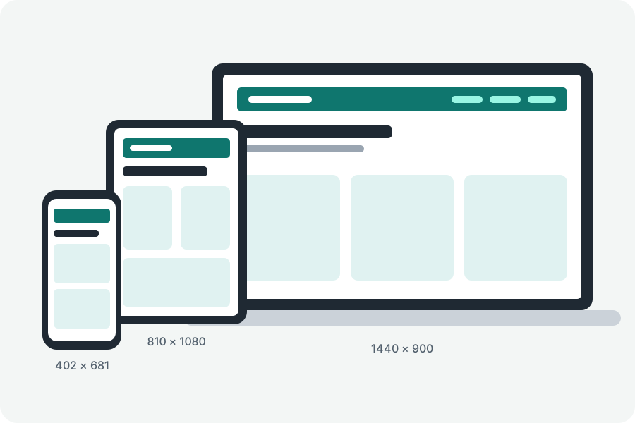
Tablets sit between the phone layout and the desktop one, and turning them moves them across: an iPad is 810 pixels wide upright and 1080 on its side. The tablet view tester shows your site on several tablets at once, both ways up.
Every tablet, both ways up.
Open the tablet view tester, type your site's address and press Show it on tablets. An iPad mini, an iPad, an iPad Pro 11, a Galaxy Tab S9 and an open Galaxy Z Fold 7 show it side by side.
Press T to turn them all on their side, or turn one from its title. Each title says which breakpoint its width is in, so you can see where the layout changes.
What it shows, and what it does not.
It shows layouts: widths, heights, orientation and the media queries that follow them. The browser drawing them is yours, so touch, the user agent and the pixel density are this browser's; check those on a real device. A site that refuses to be shown inside another page stays blank.
Nothing goes through KeepSimp.
Your browser loads the site straight from its own address, and KeepSimp has no server in between, so it never sees your site, its address or what is on it.
Further reading
Topics: tablet view tester · ipad view · test website on ipad · tablet preview · foldable view · galaxy tab view
A little less theory. A little more doing.
Try it on your own terms, with a free browser tool.
Try the tool