

See your site on every device at once.
Type your site's address or your localhost server and see it at the sizes of phones, tablets and laptops side by side, loaded by your own browser.
By Suraj KumarUpdated 4 min read
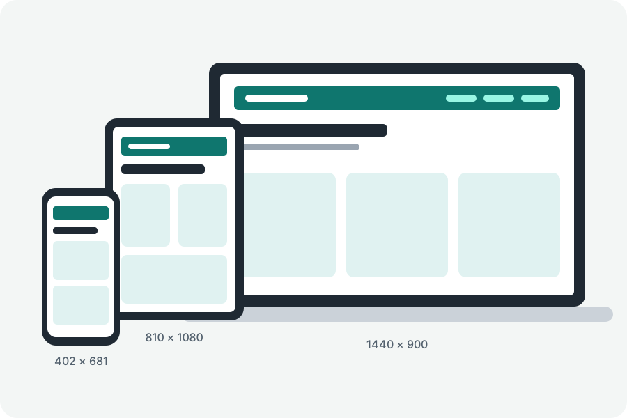
Resizing one browser window to check a layout means seeing one size at a time and guessing the rest. The responsive tester shows your site at the sizes of many devices side by side, so a menu that wraps or a card that overflows on one of them is in front of you at once.
Every size in one look.
Open the responsive tester, type your site's address or your development server's, such as localhost:3000, and press Show it on devices. A phone, a tablet and a laptop come first; tick others on the left, from the current iPhones, Pixels and Galaxy phones and foldables to iPads, laptops and desktops.
Each device is its own frame at the device's size in CSS pixels, drawn smaller to fit, so the page lays itself out exactly as it would there. Turn a device on its side, load it again or open the site in a tab from its title.
Your development server, too.
A server on your own computer works as a site on the internet does: type localhost and its port. Chrome may ask to let the page reach your computer's servers; allow it. Safari can refuse localhost inside a page served over https, so use another browser there or serve your site over https.
Scroll one, and they all scroll.
Put the one line the sync menu gives you in your site while you develop it, and scrolling, clicks, typing and going to another page on one device are done on the others too. It does nothing outside the tester, never passes a password on and stays within your own site; take it out before the site goes live.
Press the camera button and let your browser share the tab, and each device becomes a picture of its own at the size shown, to save one by one or all together in a zip.
What it shows, and what it does not.
It shows layouts: widths, heights, orientation and the media queries that follow them. The browser drawing them is yours, so the user agent, touch and pixel density are this browser's; check those on a real device.
Some sites refuse to be shown inside another page, and their devices stay blank. A site that needs a sign-in may show signed out, as a page inside another page does not always get its cookies.
Nothing goes through KeepSimp.
Your browser loads the site straight from its own address. KeepSimp has no server in between, so it never sees your site, its address or what is on it.
Further reading
Topics: responsive design tester · test website on mobile · screen size tester · localhost on mobile · synced scrolling · responsive screenshots · device preview · responsive breakpoints
A little less theory. A little more doing.
Try it on your own terms, with a free browser tool.
Try the tool